30 July 2017


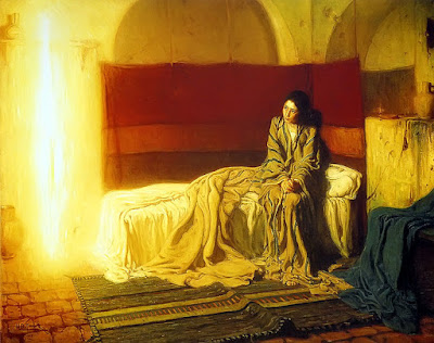
Henry Ossawa Tanner, Annunciation, 1898, Philadelphia Museum of Art.


Henry O. Tanner was, with Robert Duncanson, one of the most accomplished and professionally successful artists of African American heritage after the Civil War and before World War I. From Pittsburgh originally, he studied at the Pennsylvania Academy of Fine Arts with Thomas Eakins, and later, as still a young man, moved to Paris to study and later to work. Like the younger Beaufort Delaney, he worked for much of his career in Paris.

This painting was an astonishment to me when I first saw it. It was the first modern re-envisioning of the Annuncation, when the angel Gabriel came to Mary to announce the conception of Jesus, I'd seen. Tanner's almost dead-pan "realism" butts up against the contemporary styles of Post-Impressionism (mainly because it comes after "Impressionism"), the "realism" of his American mentor, Thomas Eakins, elements of the art nouveau of his contemporaries in Paris. He also exploits some of the incipient super-realism--"surrealism"--of other contemporaries, Elihu Vedder among others.

27 July 2017


Henry Fuseli, The Despair of the Artist Before the Grandeur of Ancient Ruins, 1778-80, pen and ink, Kunsthaus, Zurich.

These ruins, in the Belvedere Palace Collection of the Vatican date from the era of Constantine. Fuseli, the Swiss arch-romantic, spent much of his career teaching at the Royal Academy in London. He's famous for imaginatively juxtaposing the human figure with the more or less monstrous, exploiting the contrasts of scale or reality, even, to approximate the newly re-codified aesthetic category of the "sublime." More on that another time. But Fuseli here carefully composes the image with an oddly, half-dressed artist, embracing the foot of Constantine and holding his head in ambiguous grief.

The ruins themselves are a partial collection of fragments of a monumental sculpture of the Emperor Constantine himself, slightly reconfigured for the artist's purposes. He chooses only the reversed hand and the foot, emphasizing scale, not personality.


26 July 2017


I took this picture in 2003 while on a trip to Tabasco with my friend, Louise Hose​, and company to explore the Cueva de la Villa Luz (the Cave of the House of Lights) near Tapijulapa. It caught my eye, and I've since discovered it's iconic for Palenque sculpture. The trip, the people, the cave (and who can escape the poetry of the name--the Cave of the House of Lights?) all were iconic for me.

The rodent jaguar is at the base of a pilaster (an attached, non-supportive column or pier) is expressive of the Mayan's innate ability to somehow combine naturalism and fantasy, zoology with the monstrous.  Certainly it's an unsettling greeting at the top of a climb up a funerary temple platform.  Like their hieroglyph writing, Mayan forms emphasized and kind of fluid geometry with rich, rounded forms with very few sharp edges (say in it's right cheek bone), and no angles.

This was my first trip to Mexico as an adult and, I'm afraid, it spoiled me. Palenque is only partially carved out of the forest--there's still much to be excavated--at the point where the mountains meet the coastal plains near the border of Chiapas and Tabasco states.  It's exposure is eastward, towards the dawn and towards the Olmec territory, a civilization that preceded the Mayan civilization by a millennium. Compared to other, similar sites,  it's relatively unvisited, undeveloped, and the rules of exploration very lax.  You could still climb the pyramids, enter the palaces, sit and ponder--as I did with the college students who accompanied me.


Pilaster base, Temple Of Inspcriptions, 7th century , at Palenque, Chiapas, Mexico. Photo by JRPC

25 July 2017


Jan Van Goyen, Dunes with Travelers, 1628, recently sold at auction in Prague (for a surprisingly small amount of money).


When I went to L'Abri in Eck-en-Wiel, in the Betuwe of central Holland (the "land between the rivers"), in the autumn of 1973, I traveled all over the country; it's not very big. I'd only heard of a few big names in Dutch painting, and was only beginning to understand my own preoccupation with landscapes. Van Goyen struck me even more profoundly than the other Dutch landscapists like Ruisdael, Hobbema, or even Vermeer and Rembrandt, who struck me profoundly enough. Every one of Van Goyen's skies was different. And every one was, somehow, right. The color of the Dutch sky--which I watched from my the window of my unheated garret's window on the third floor of the big farm house in the orchard by the canal--changes like screen saver. What struck me for the first time in my life was that those skies were big, like Montana's, wet like Massachusetts's, and never simply white and blue and gray.


The infinite palette and textures of the sky are remarkable in Northern Europe. There's not much relief in the landscape to distract. And Van Goyen tracked every one of them. And it was something of a revelation after traveling to the cities of the country--Utrecht, Amsterdam, Rotterdam, Delft, Haarlem--to come to the North Sea in Zandvoort and fine dunes, just like home on Cape Cod. Van Goyen picks up on that, too. Sand like mashed potatoes, as here. But Van Goyen's skies and landscape run the whole gamut of what Holland offers. And they offer a naturalism that anticipates Constables, two centuries before. Still, like the other seventeenth century landscapists in France, and Italy, he finds a way to compose using coulisse devices


Holland was a wonderful experience for me. Art was a central part of it, but so was the rural and urban countryside in the deepening fall. And the skies. I read the complete works of Robert Frost to feed my New English nostalgia.


21 July 2017

If you have the chance--and if there are still tickets available-- try to see Romeo and Juliet at The ARTS at Marks Garage this week end through 23 July.  It's a great, intimate production with terrific performances across the board, especially the leads, my friend, Ari Dalbert as Romeo and Alisa Boland as Juliet.  


                           http://www.HawaiiShakes.org


From the leads through the whole ensemble, the cast works beautifully together to refresh an overly familiar play. ( I team-wrote a brilliant satire on Shakespeare's tragedy in sixth grade. A three hour, pre-pubescent satire.) Since then I've seen multiple productions  on screen and stage, from the restrained to the gimmicky. Ho Hum. A few strategic cuts make the play a comfortable just-over-two-hours, and, though costumed in generically modern dress, the production is remarkably faithful, the staging and lighting spare, flexible and expressive.

In this production the first half is a delightful comedy full of physical pratfall, adolescent gasps and shrieks.  The second half is compelling tragedy.  The direction and performances are remarkable pitting adolescent irrationality against adult irrationality.  Everyone loses. The youth of the leads makes the play all the more believable.  And, staged in three quarter round, the Shakespearean language was completely audible for these failing ears.


19 July 2017


Meret Oppenheim, Object (Fur Breakfast, Fur Covered Cup) 1936, MOMA.


This is by way of experiment to see exactly how much text fits in before the "see more" option cuts it off. My plan is, for the moment, to write on Facebook only what text will show up above that line before I insert a link for my blog for more detailed text.....So, it appears it's about five lines, and I'll try to work with that. I'll start on Facebook with what's most personal in my response, and then go on the the blog for information. Well it's more than seven lines. And I've always loved this piece which feels to me like the polar antithesis of the period's art deco. Don't tell PETA, but I really like fur, and am infatuated with it's textures against form, or against other, contrasting textures like Ruben's portrait of Helena Fourment that I posted earlier.....OK. I'm confused because it appears that I can write more lines than I thought at first before the break... I'm enraptured by how cozy the object is, how soft, and how disgusting it is (literally dis-gusting) if you think of the etymology of the word. The texture of the spoon (wrapped in fur) against the texture of the tongue, the texture of the cup against the liquid it would ordinarily contain...Oppenheim was a Swiss artist who had associations, especially conceptually, with the dada movement of the early 20th century.